The in-store customer experience determines just how much cash ends up in the till at the end of the day.
A pleasant experience? Profit. A sour experience? Well… you get the idea.
Providing a great in-store experience means businesses have to get in the heads of their shoppers.
In this article we’re going to follow a customer on their journey through a typical retail customer experience, to see what works and what doesn’t; what makes an in-store customer experience positive and what turns it into a disaster.
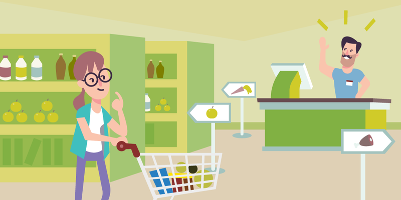
Meet Michelle. She’s our imaginative customer, a typical shopper in any store we can imagine.
When Michelle walks into a store she’s on a mission: the gliding doors open because she intends to purchase something. Maybe she doesn’t know exactly what, but she has a general idea.
What she does know is that getting from point A to point B in the most direct and smooth manner is essential for Michelle’s in-store customer experience.
First Impressions: The Line

Like it or not, first impressions count, even though they’re often erroneous.
A horde of people waiting in line with frowns does not bode well. It tells our fictional customer Michelle several things:
This store is very chaotic.
I don’t have time to wait around.
I need to shop somewhere else.
Remember: 86% of customers will abandon a store if queues are too long.
Save your customer’s time by understanding their expectations of the retail customer experience — and surpassing them.
Visitor Management

What if when Michelle walks into the store, there’s no line at all. Instead, she’s greeted by a fancy, eye-catching visitor management system.
“Wow, this is fancy,” thinks Michelle. She taps the screen, signs-in, and her name is automatically added to a digital queue. With just one iPad, she feels that her needs are already taken care of.
When it’s her turn, she’ll be called up and greeted by her name - a building block of creating a personalized customer experience.
Not only that, but she can see where she is on the waiting line on various screens throughout the store, or get updates through text messages.
The sense of dread from staring at that line is mitigated by the visitor management system. Plus, the store appears innovative: “hip” and “with-it.”
A visitor management system creates a modern atmosphere and fosters an easy, positive customer shopping experience.
As an added bonus, businesses collect data on their customers through the visitor management system: customer shopping habits, how they interact with the store, how long they shop, the waiting time, service times, etc.
That data then translates into an improved customer shopping experience and a bigger bottom line.
Double-Check Your Store Design
Stores have to follow logic. I don’t mean a logicians’ corncob pipe smoking logic. But an internal store logic, so that the customer can easily navigate the store and find what they’re looking for.
If Michelle is faced with zig-zagging aisles and disparate merchandise lumped together on haphazard tables, she’s going to be confused. And confusion quickly turns into frustration.
And what does frustration turn into? A lost customer.
Why would anyone continue to shop somewhere that’s frustrating?
If people don’t want to shop at your store say goodbye to the bottom line. You’ll be out of business before customers can answer your surveys.

An Intuitive Layout
Michelle wants to find new shoes for her son Tommy. But the store is crowded: it’s after 5 PM on a Thursday. All of the walkways are choked with customers even though there is plenty of space between displays.
Unable to navigate the store, she leaves. The in-store customer experience is both insulting and exhausting. Michelle goes to another store across town, giving them her business.
Could you tolerate the aforementioned retail customer experience?
Stores need to lay out their aisles and merchandise in an easy-to-understand manner.
That means a well-informed layout for the most accessible customer shopping experience.
For example, an open space, where plenty of people can pass by each other at peak hours. Along with well-placed signs, and a discernible logic to where items are placed, i.e. turtlenecks and hardware shouldn’t be side-by-side.
Looking at data informs businesses as to where their choke points are. Where customers become confused or tarry instead of moving on in their journey.
The data informs a business on how to rearrange its store layout for a more efficient retail customer experience.
But even without data, we have a simple principle: avoid making a labyrinth; no customer should need to bring a ball of thread to find the milk and bread.
Sorting Like With Like
Stores also need to have some intuitive sectioning to them. Lump like with like: clothes are in one area of Target, electronics in another, ice cream in the far back. You get the idea.
The in-store customer experience needs to flow, like a gentle creek not a raging river.
This is obvious. What store doesn’t do this?
If Michelle is going to have a positive customer shopping experience and make it to checkout, she needs to be able to move through the store with ease.
The point is, make it easier for customers to spend money at your location, not the other way around.
Clearly Labeled Signs
Michelle wants to find the hardware section. She needs to buy a drill bit so she can mount her television on the wall of her apartment.
But she can’t find the hardware section. There’s no employee around. And for some oddball reason, there are no signs to be found anywhere that say “Hardware”.
Sections of a store have to be properly labeled.
That means clear, bold lettering. Otherwise, the business is failing to meet the expectations of the customer shopping experience.
Frustrated with her first pick, Michelle takes her business elsewhere, somewhere where great big signs tell her exactly where she can find that 5/32 drill bit.
A Green Environment

Let’s talk about the color green.
Studies suggest that green buildings have a positive impact on people. What do I mean by green buildings?
I’m talking about a building that incorporates fresh air, maybe some aesthetically pleasing philodendrons, natural lighting. Green buildings bring the outside inside.
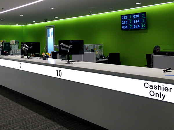
If you don’t know the color green has a calming effect on people. It makes people less anxious: less prone to stress. And don’t forget, customers like Michelle are people too.
Businesses can improve the customer shopping experience by adopting green building trends.
According to the World Green Building Council:
“A Walmart concept store in which only half of the store was daylit found that sales per square foot in the daylit areas were significantly higher. And consumers are likely to buy more merchandise in stores with natural surroundings according to some research.”
Humans did live outside for 100,000 years before the first cities emerged. No wonder green is calming. Its homo sapiens’ ancestral home, and what’s more calming than homelife?
What Do Customers Want From Your Store?

Here’s a paramount question that’s always worth re-examining: why do customers shop at your store?
Well, if your answer is “to buy things,” then you need to pick up a piece of chalk and head to the blackboard.
There are different kinds of customer shopping experiences. Michelle runs to a corner store — small grocery store or bodega — to buy things she needs quickly and in small quantities: snacks, drinks, lottery tickets.
The corner store serves a purpose and it understands the kind of in-store customer experience its customers expect: reflected in its small design and condensed displays for easy customer access.
Now, what about a beauty store? Does it just sell makeup, lipstick, mascara, hair dye? Well, it could. Or the beauty store could take it to the next level to create a truly rich retail customer experience.
Ulta Beauty began incorporating salons in their stores a few years ago and saw a huge, 23.7% increase in net sales. The brand began to outpace its competition even though Ulta was already two decades old.
Their strategy was to fill a gap that no one else had done, merging what seemed like two distinct businesses into one to deliver a more fulfilling customer shopping experience.
Employee Engagement Wins Customers

What we’ve been orbiting so far is the word “engagement.” Positive engagement is how businesses foster positive retail customer experiences. And nowhere is that more evident than through the store’s employees.
When Michelle is looking for a particular item and can’t find it, she turns to an employee and asks for help. If the employee can't help, Michelle isn’t leaving the store with a positive impression.
To foster a better customer shopping experience businesses have to do two things: empower employees and incentivize employees to give their best.
We turn to Qminder, which empowers frontline employees with Service Intelligence they need to make decisions.
Give employees autonomy and training to help customers like Michelle find what they need and answer any questions.
Employees are the human element of your store. Good employees can turn the four concrete walls of business into an extension of the larger community.
So, incentivize employees to provide positive retail customer experience. Better rewards equate to harder work.
And don’t forget to thank employees who do go out of their way to help customers like Michelle and do an excellent job.
Happy customers are fostered when businesses go out of the way to understand the customer shopping experience. To see from the customer’s perspective.
Creating a seamless, helpful, friendly atmosphere is key to ensuring a customer begins and ends their journey with your business. And it makes the customer more likely to return.
By improving the customer shopping experience, businesses meet the needs of their community while simultaneously improving their bottom line.
Want to try out the new, innovative way of welcoming customers and get service data from all the interactions? Qminder is free to use for 14 days - no credit cards required.


