We at Qminder are firm believers that healthy competition among employees breeds excellence.
In fact, this is something we noticed some time ago among our clients: people use Qminder not only to provide better service but to beat their personal best and exceed the number of people served by their colleagues.
“Customer service as a competitive sport? Well, that’s a new one,” we thought.
Fast forward a few months, and we launched User Details into the wild — a special page in the Qminder dashboard that gives an overview of a user’s performance and compares them to other users.
How User Details work
You may have noticed that there is no “how to get started with User Details” section. That’s because the step-by-step instructions are, well, just two-step long:
Step 1. Go to https://dashboard.qminder.com/me/
Step 2. We fooled you, there’s no step two.
You can also access User Details by either:
- Clicking on a user’s name in the Overview
- Using the search function to find a user’s profile page
- For managers: going to the Team tab under Locations, and selecting a user.
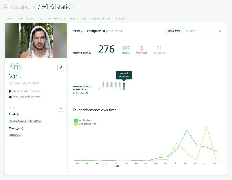
Whichever option you choose, this is what you’re going to see:

There’s a lot to unpack here, so let’s take it from the left column.
User Details makes it easy to see, at a glance, who each user is and what they are doing. The left column shows the user’s full name, picture, email, the date of creating the account, and their designated role(s).
For example, Kris here is a clerk and manager. Notice that for non-admin roles, you have to list the specific locations the user works at.
You can add or change the assigned roles on the fly:
- To add a role, click + and then choose from a list.
- To remove a role, click x.
NB: If you have a higher level of access (administrator, location manager or account owner), you can also remove user by clicking REMOVE USER ACCOUNT on the bottom.
That’s about it for the left part of the User Details page. The right half is where the real magic happens.
How [USER] compares to the team
I. Visitors served
The first section gives you a nice breakdown of all visitors assigned to this user.

They are segmented according to the type of interaction they had with the user:
- Served: showed up to the service desk during their turn.
- No-shows: called to the desk but did not show up in time.
- Cancelled: removed from the waitlist.
II. Visitors served by the team
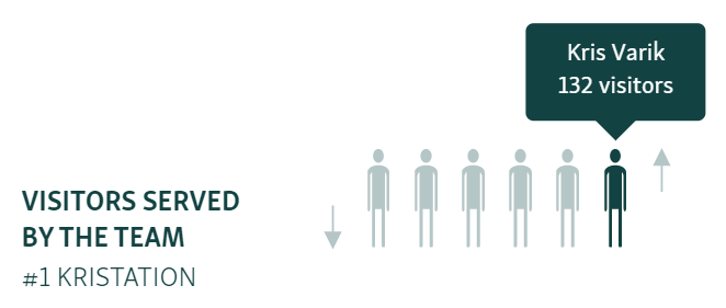
This brief section shows, in an illustrative way, how each team member stacks up to the rest.

The highlighted figure is the selected user’s placement in the team. The farther to the right it is, the higher the placement — notice the up and down arrows on each side.
The best part is, you can see exactly how far ahead or behind you are. Simply hover your mouse over each member to see how many visitors they’ve served themselves.
(Just promise that you will not use this power to gloat.)
By default, the numbers in the How [USER] compares to the team section are pulled from data over the entire time. You can set a different time frame in the rightmost corner, by choosing either:
- All time
- Last week
- Select period (choose the beginning and end date from a calendar)
The data will dynamically change according to the selected time frame, giving you a valuable insight into the nature of service and performance trends at your locations.
How [USER] performed over time
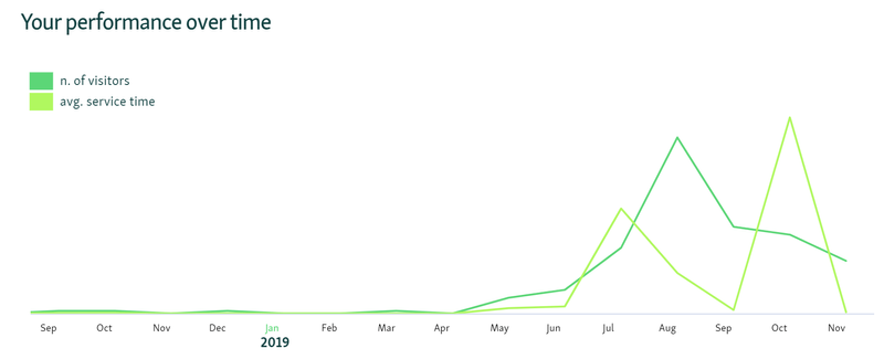
Last, but not least, is the overall service data. Nothing difficult here, just a graph showing the two most important metrics:
- The number of visitors
- The average service time

The graph gives a good visual indication of the trends in these metrics. To see the exact numbers, hover over the line above the date that interests you.
As the graph shows all the data since day one, it may not always fit in its entirety. In such a case, freely move the graph left or right using the navigation buttons at the bottom corners.
User Details is only a few months out of the oven, but it’s already garnered some praise from the users of Qminder who were vying for a feature like that.
The new page has won people over with its usefulness, simplicity, and visual flair.
If you’re already signed in with Qminder, bookmark https://dashboard.qminder.com/me/ as your homepage to always see how you’re doing.
And if you’re yet to discover the wonders of virtual queue management, we’ve got just the solution.


