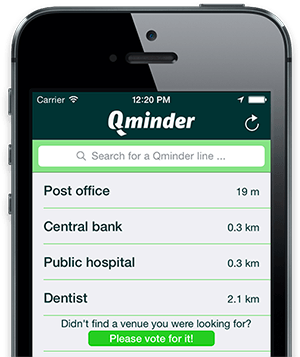
Qminder loves the flat design of iOS 7
Apple recently introduced world with their newest iOS version. The user interface has changed completely. Now all applications must pick up this new look and feel as well. The new conception is created to concentrate more on content and make design flatter and easy to understand for users.

The Qminder development team made the decision to not only redesign for the new iOS 7, but rewrote the whole application from ground to adapt new features functionally and visually. This took us some time but outcome is mind blowing. These are the biggest changes in our iOS applications for iPhone and iPad ever.

The new Qminder line-up application user experience is simple and brilliant at the same time. We believe that applications should not only be functional but designed well too. Design is not just what it looks like and feels like. Design is how everything works. We focus on simplicity and Qminder is clear to understand for users without any user guides or manuals.

Making insanely great product is not just packing it up with dozens of features, but make things more understandable and simpler to user. We focus on on quality, less quantity.

We made Qminder because at Qminder we all mind waiting in line and now it’s your opportunity to skip the waiting line! Try out Qminder at your business and bring your customer satisfaction to next level.
